
The New Amex Mobile App
Roles:
Primary User Experience Architect, Lead UX Practitioner, Visual Designer
The JobS to be done
Our business mandate was to increase downloads and engagement. Our design goal was to figure out what a mobile credit card app for American Express should be for our users. We identified the jobs to solve through research, and came up with some assumptions.
Research and Evaluation of the Jobs
We audited our mobile analytics for the existing app to figure out what was being used and what wasn’t, and posited why. We did a teardown of our competitors’ apps and assessed mobile heuristics in the space. We studied tons of ethnographic research and persona studies done for the Amex cardmember population. We peeled through app store reviews and conducted verbal surveys on the current experience. We talked to users before we began–and more importantly–all the way through development.

Ideation
In time–through cycles of card sorting, whiteboarding and sketching sessions–we arrived at a sensible information architecture to solve the primary jobs of, "Is everything good with my account?", "What do I owe and when?", "What happened most recently?", "I want to make a payment", and "What do I get by using my Amex card?".


A Versatile IA
A new information architecture was developed that solves the jobs of servicing and membership, and establishes a platform for future innovations to be built upon it.
Click here to open a hi-res PDF of the below map in a new window.
Wireframing the Experiences
Detailed wireframes were made based on product user stories. Edge and corner cases were explored where possible. Everything was tested, iterated upon, and tested again over many cycles.
Recent Activity: The most recent ins and outs of my account
Separating most recent transactions from the billing and payments part of the app, solves the more frequent job of verifying my charges and credits. I can make sure there aren't any questionable charges made to my account. Over time, the platform provides a way for interesting transaction details to emerge, and the extras I get from using my Amex card.
The Billing Counter: Am I Good?
Part of the job to solve for a mobile credit card app, is the question of "Am I good? What do I have to pay and when, so that I'm in good standing?" We solved this by displaying different stages, based on where the cardmember is in their billing cycle, and depending on what card product(s) they own. The below wire flows specified the various phases for this hero section.
Click to open a hi-res PDF of the below wireframes in a new window.


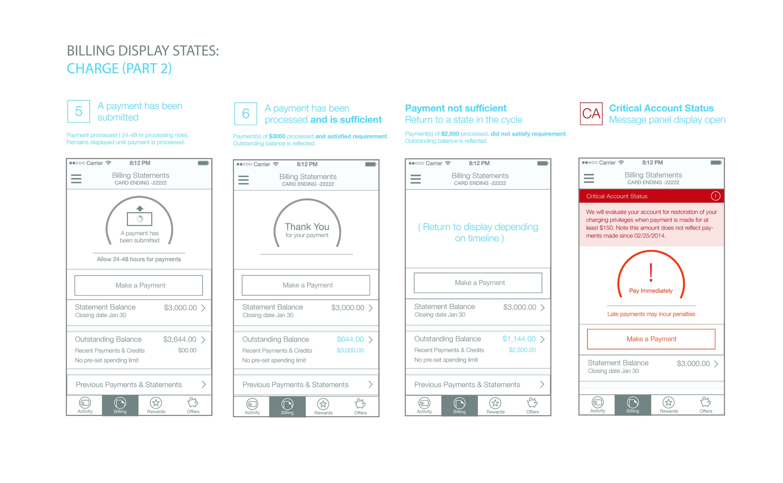
Timeline Matrix for When Payment Messages are Displayed
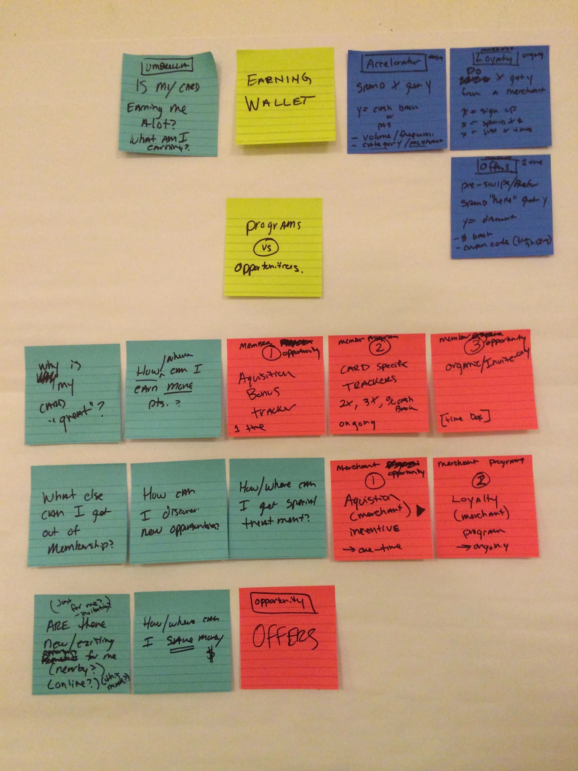
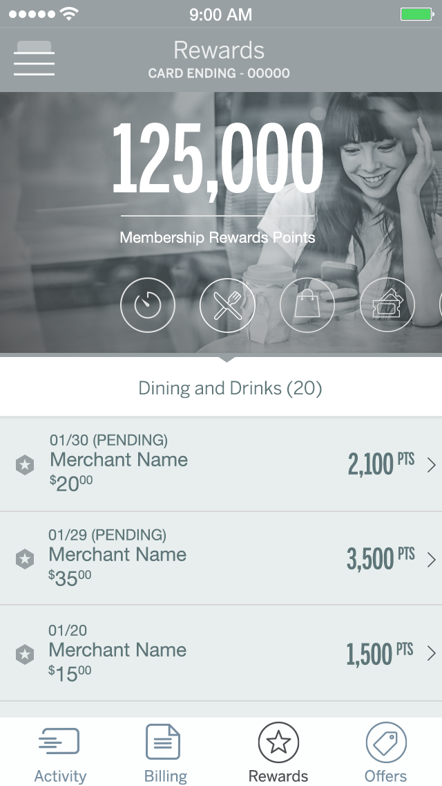
Membership Tabs: Rewards and Amex Offers
The two right-most tabs in the top level IA deal with Membership. "Rewards" allows the cardmember to see what their points/cashback/miles balance is at any time, and options to redeem and take advantage of that currency.
"Amex Offers" helps cardmembers find ways to save and earn back by using their card at merchants.
Paper Prototype Testing and Validation
User testing with tap prototypes began once the general IA was validated. In formal test sessions and impromptu guerilla testing, we checked assumptions and iterated on things that weren't working.


Video Demo of Wire Prototype for User Testing
We produced this tap wireframe prototype in Proto.io, as a stimulus for user testing. We interviewed users in various cities, in their homes and at their workplaces. We learned how people use (and prefer to use) a credit card app on their smartphone.
Visual Design Exploratory
Various approaches to visual design were considered. The goal was to keep to the American Express brand, but establish something fresh and neutral for the mobile app expression. The example shown here incorporates a key color for the interface, for each card product.


Video Demo of Amex Mobile Alpha Build
As we worked with the engineering team to collaboratively produce and refine the design through product-led user stories, an internal alpha build was produced and updated daily. Using real card accounts, QA could test against a range of extension and edge cases for all Amex card products.
Product Results
- We built a scalable and logical information architecture to house new user-centered features in an extensive product roadmap.
- Credit card jobs of "What do I owe and when?" and "What transactions happened recently?" were separated from each other and solved specifically.
- Fraud and credit issue resolution can now be done from within in the app.
- Amex Offers is now top-level, where before it was buried in hierarchy. An overwhelming majority of testing respondents said they would visit this section regularly if they didn't have to go find it.
- Research showed pared-back, minimal design feels contemporary and reinforces trust in American Express brand.